A curious thing happened while curating a photo show lately. (Maybe that’s where the word came from.) Gallery owner and photographer, Peter Miller, asked me to be the juror of a show he was having at his Povidence, RI gallery a couple of months ago. It was an open call posted on Cafe Call for Entries, to be judged and displayed in the gallery. We received 418 submissions on relatively short notice. I was very surprised at the high quality of images from mostly a fine art contingent of photographers nationally. It was impressive. (Here’s a link to Peter’s Gallery
The assignment was to pick the 70 images that would end up on the walls of the gallery for the show. The harder task was to pick from that group of 70 to find the first, second, and third place images. Peter Miller was also selecting a back up list for the sake of comparison. There were so many good images it was a difficult process. I went throughout the entire group 8 times.
We worked separately on line and without any comparison of our selections. Of the 70 first choices for the show 65 were the same. How co-incidental. From there we decided to narrow it down to 10 contenders for the first second and third awards. Our ten best were identical. From there we chose the winner, the 2nd and 3rd place. They also matched exactly.
This was a very surprising phenomenon to me. But from what I hear, it’s not so unusual. Good stuff is read as good stuff by most interested viewers. I’ve worked with Peter and known him for about 20 years. But we don’t really talk about preferences of photographers, styles or qualities of fine art photograph. I have to suppose that if you spend a lifetime looking at images and studying visual arts, we must have arrived at some of the same conclusions.
When we review images as we shoot in the studio, it seems everyone blurts out a “Wow” at the same shots. It’s a peculiar phenomenon that as diverse as we all can be, we all seem to react emotionally to the same visual signals in a photograph.
Here are the 1, 2 3 images,
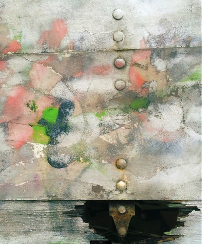
1) Pierre Hauser – Delivery Truck Door #2. Pierre’s submissions were consistently beautiful, visually thoughtful and deserves recognition for quality thorough out.
This is first a well seen abstract ballet of pastel delights in subtle hues. The components are well balanced while my eye dances around would-be birds and faces and finally follows a string of dots to a dark counterpoint of shadows providing a rich base of details in the shadow areas. Though I went through the total of 418 submissions at least 8 times, this image stuck in my mind each trip. The economy of components, the play of colors in space, and the choice of elements ultimately contrasts the dimension of airy elements playing above this murky rooted foundation. Beyond the composition this image evokes a metaphysical scenario that suggests a balance of contrasting emotional moods. Maybe decay and renewal. And all in a single moment discovered on the back door of a delivery truck. This photograph represents the power and the purpose of a photographic vision. It’s well seen photographic magic.
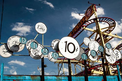
Cindy Wilson, “Easy Dime Toss” 2015
2) Cindy Wilson – “Easy Dime Toss” Is a whimsical wide-angle play of shadows and shapes that appear 3D and pop off the print. The bright round temptations pull us right into the fun of this fantasy land. Broad blue sky and clouds from a low point of view are the perfect simple backdrop for this powerfully amusing composition.
Submitting consistently good entries deserves recognition. There were several photographers whose work shows quality thorough out a series of images. Consistency proves a level of competence and control beyond having a few lucky shots. Cindy Wilson’s got the shots.
3) Joseph O’Leary – “Ryan” from the series “Of Beards and Men” A photo illustration portrait in a very current style. The concept is witty and ironic – and is supported by an impeccable studio lighting technique and a de-saturated post production quality that gives the shot immediate strength and impact. The composition remains simple and straight forward while the directing of the subject totally supports the amusing mood of the moment.
This is a gallery show – so good print quality counts.
Here’s a link to the whole show. http://www.petermillerfineart.com/current_exhibit/past-exhibits/open-call-photography-show/


